User Problem
Risk Managers often needed to present our platform’s graphs and charts for their company’s executive presentations and quarterly reports. At the time, our platform provided no options to do so, resulting in shoddy workarounds (e.g taking screenshots, or saving a PDF of a print preview). This lack of an export feature was creating major friction to the Risk Manager's workflow and unpleasant sentiment.
Research
Discovery insights
At the time, we were unable to reach our users, so we interviewed a number of our client-supporting coworkers about the various use cases and expectations around exporting. We also reviewed over previous written customer feedback through our feedback portals, and customer calls where this issue came up.
What we learned from our interviews
- These visual reports were being reported to very high level executives. The lack of resolution from screenshots were creating negative sentiment about our platform in general.
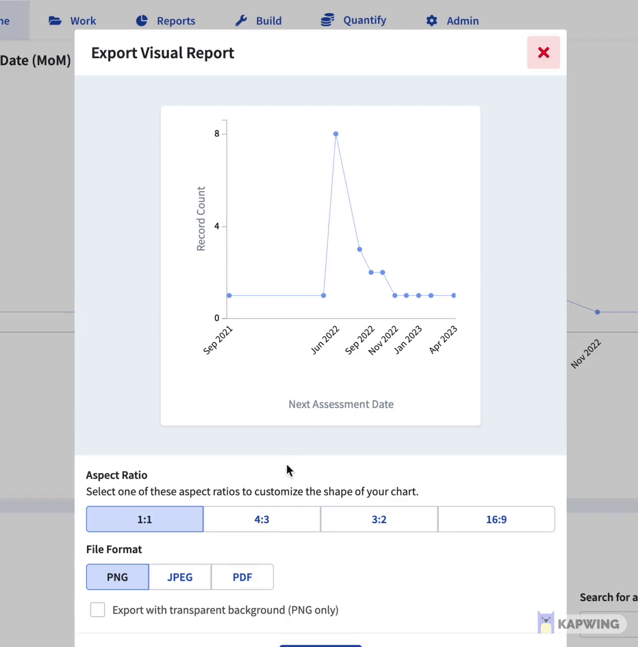
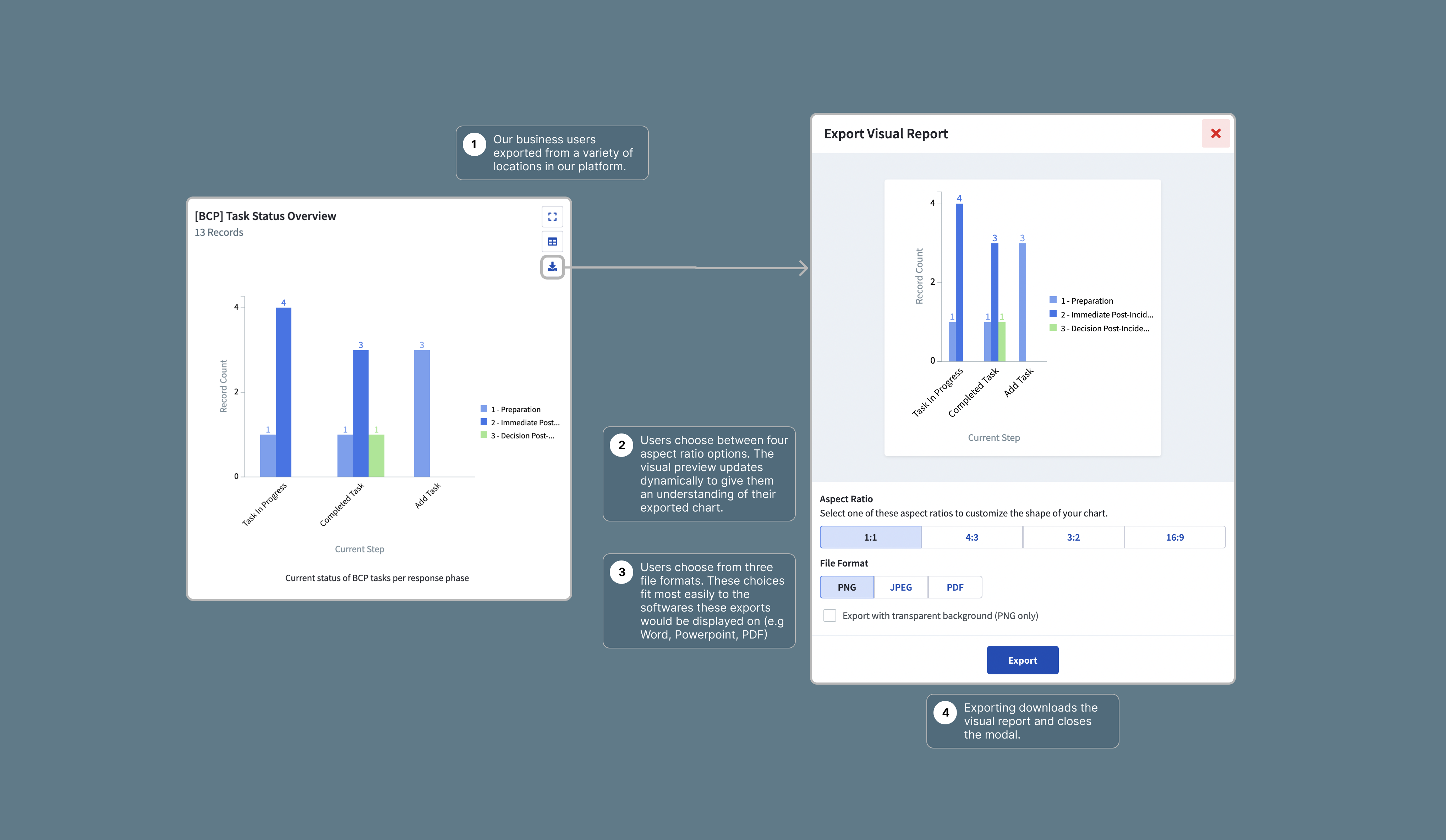
- Most of the exports would be presented through Powerpoint. How could we optimize our export sizing to align with that?
- When exporting, most people were doing so from Dashboards.
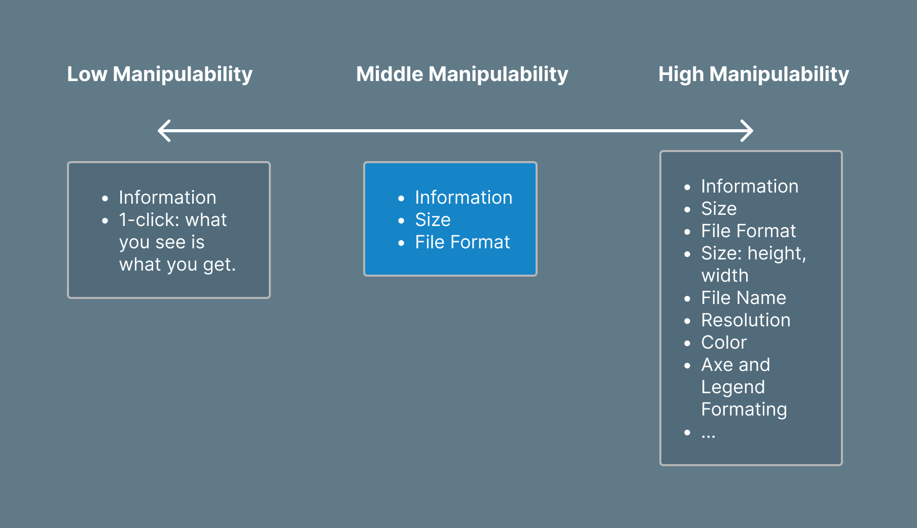
Manipulability was polarizing
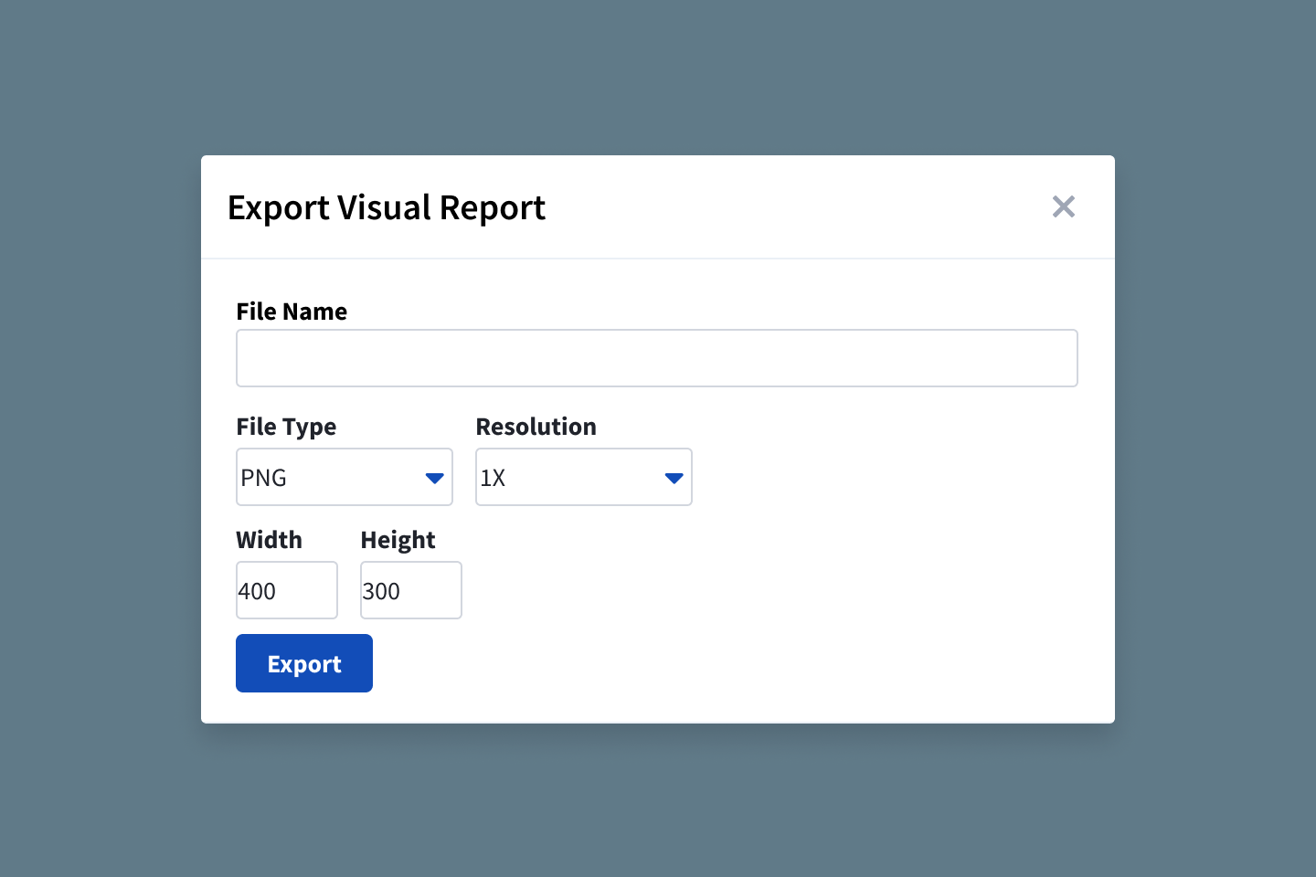
Some users desired a one-click simplest experience, while others desired a handful of options to customize their export. Working with my product manager, we decided to focus our experience on middle manipulability. Items in the high manipulability were desirable, but we felt that those should be configured during the set-up process. In addition, they posed additional technical complications for an MVP.
We also decided that a high-resolution output should be default, rather than an option. We could leverage our knowledge on Powerpoint dimensions/resolution to set a default resolution.