AboutIn the Lab

Access-based Home Screens

COMPANY:

LogicGate

SUMMARY

Upgraded the Home Screen creation flow for Risk Cloud builders. Designed the self-serve migration flow to facilitate customer adoption of new Home Screen functionality.

USER NEED #1

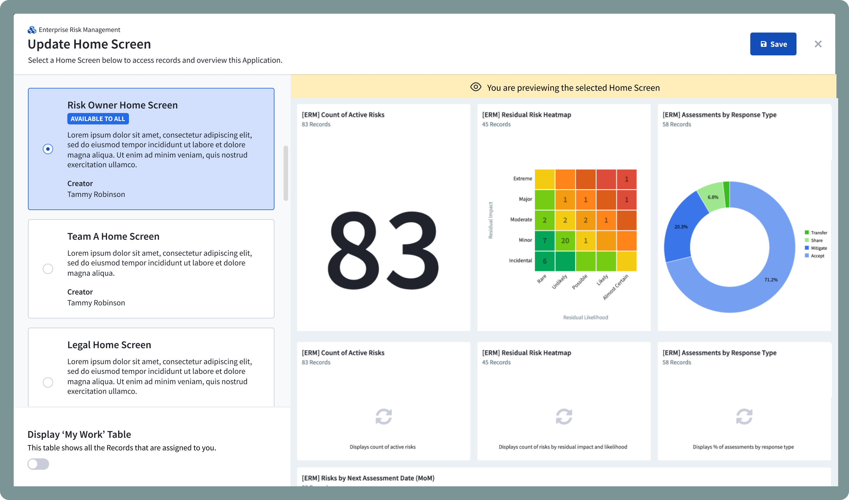
Risk Cloud builders needed unique home screens for different types of users.

Governance Risk and Compliance (GRC) processes often have multiple contributors that play different roles within the Risk Cloud.

Risk Cloud's home screen serve as a way for users to quickly access their work through different reports and tables. The previous Home Screen functionality severely conflicted with customer's organizational patterns – only one Home Screen could exist per Application. This led to these pain points:

It was clearly a user need metrics-wise:

User NEED #2

Realign the location and object hierarchy to the user's mental model.

Previously, a dashboard, which makes up the charting component for the Home Screen, overarched the Home Screen. Users would have to 'set a dashboard as a Home Screen', which felt backward in the object hierarchy of Risk Cloud.

Early on, I prioritized reversing the object hierarchy – Home Screens now presided over dashboards. This structure felt more intuitive and enabled us to attach the permissions attribute directly to the Home Screen object.

To determine the location of the new Home Screen configuration flow in our information architecture, I aligned to our Builder’s mental model of Home Screens.

They understood Home Screens as a representation of work under an Application. Therefore, the most natural location to place the Home Screen page was the Application Canvas, the central spot for building applications. Builders could configure all of an Application’s elements in a centralized area.

Deliverable #1

Home Screen Configuration Experience

Builders follow a three-step process to efficiently create Home Screens for their end users.

Step 1: Connect Dashboard

Dashboards provide the main interactive content for users to interact and overview with their Application. The design allows builders to preview different dashboards that suit their specific user's needs and reduces the need to open multiple tabs to view dashboards.

Step 2: Set Access

Builders set exact access controls for this Home Screen. Whether it's made accessible to all users, or a select handful of contributors, Builders can specify any combination through the users and roles selection.

Step 3: Describe and Summarize

Summarizes the settings of the Home Screen before creation. Since, End users have limited understanding of the objects in Risk Cloud, we included name and summary fields for builders to provide guidance for their end users, so that they can choose their Home Screen confidently.

Deliverable #2

End User Flow: Selecting a Home Screen

After Home Screens have been made accessible to End Users, they can select the one that best fits their responsibilities at that moment. Depending on their role, they may have access to multiple Home Screens.

Similar to Step 1 of the configuration flow, End Users can quickly preview what their Home Screen will look like and choose confidently. For those with multiple responsibilities in an Application, they can quickly switch between different ones to suit their needs.

Deliverable #3

Migration from previous Home Screen UX

In the past, we knew a huge reason for lower adoption was also due to the amount of overhead needed to update to the newest functionality.

After conducting a SPADE discussion with our stakeholders on how to combat this issue, we landed on providing a self-serve migration experience for Builders to update their older Applications to the newest Home Screen functionality.

In 4 steps, Builders could now transfer all of the individual Home Screen reports into a Dashboard and connect it into a newly created Home Screen.

Design Notes and Iterations

Wizard Component enters the design system

Despite having many stepped experiences in Risk Cloud, there was never a dedicated stepper component established, which caused platform-wide inconsistencies in UX.

Working together with the Design System, I designed the the wizard header component, a variant of the headers used in our modals. Artifacts included usage guidelines, and different state variations. This component was quickly adopted and used in 3+ upcoming features within the first quarter of its introduction .

Diagram of the wizard component. Outlines different elements and usage guidelines.

Iterations on Step 2: Set Access

Throughout design iterations, I strove to simplify setting permissions of a Home Screen, while retaining the core flexibility that Builders wanted when assigning access to their users.

The early iterations contained too much extraneous information often not needed in the context of Home Screen building. Rather than stretching the interface to fit more information, I eliminated information throughout each iteration.

Two early iterations of Step 2.

Outcomes

We improved Home Screens to match the complexity of our customer's Risk Programs

On May 2023, the upgraded Home Screens feature was released to our first cohort group. Customers voiced a ton of praise for this feature, with some of our largest enterprise customers immediately creating 20 Home Screens per application.

Adoption for the Home Screens feature quickly increased, from 16% to 43% from May to July 2023, and eventually to 97% by November 2023 of live applications with Home Screens.

Feedback from users

"This is something we've been wanting for a while and it answers a pain point we've been having. ...reduces friction between admin team and business. End users know that this is their home screen."
"Nothing is confusing to me, This would probably be pretty intuitive for someone new as well. "
"The access based home screen feature is absolutely amazing. We've already implemented for 2 applications and more will be following soon.